
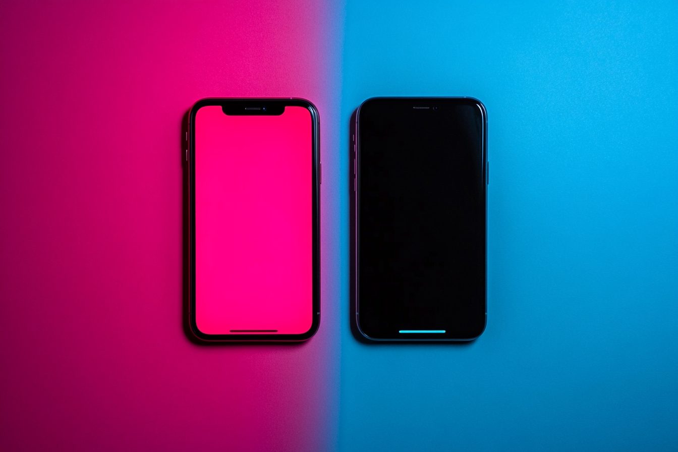
I knew I was facing problems in my marriage when my wife and I resorted to hanging out on different devices at night. It wasn’t the screens per se that led to the fault lines – it was the content that was being displayed. To be more specific, the color schemes. I am a devoted dark mode user; the sort of person who has every app, browser, and operating system set to that sleek, battery-saving black background with light text. On the other hand, my wife is a light mode lover unapologetically who has her devices set to retina-searing white backgrounds that turn our bedroom into an ad-hoc lighthouse after sunset.
“It’s like sleeping next to a supernova,” I said one evening, trying to cover up my eyes from the bed’s brightness.
“At least I don’t look like I’m planning an assassination every time I check my emails,” she replied.
And so, the battle lines of the great Light-Dark divide were drawn in our household and have been distinguishing households, offices, and friend circles globally. This isn’t simply a display preference but classification markers that sets us apart with the potential to spark heated debate unlike any other—like using Oxford commas, saying “GIF,” or whether or not you enjoy pizza topped with pineapple (you shouldn’t, dispute me if you will).
People’s propensity towards their particular display modes became evident to me when I was working at [REDACTED TECH COMPANY]. While enabling dark mode on one of our products, I realized that what we expected would be a mere update on the existing features turned out to be one of the most celebrated and requested updates. People were more excited about the announcement than the actual performance improvements over the features that took months of engineering work.
While conducting user research after the rollout, we were amazed as to how users framed this most enduring preference in the context of social identity. “I’m just a dark mode person,” someone would say, or “I would never use dark mode — that’s not who I am.” None of these discussions focused on the more concrete approaches such as battery life or eye strain. Instead, these were expressions of digital identity and self-representation.
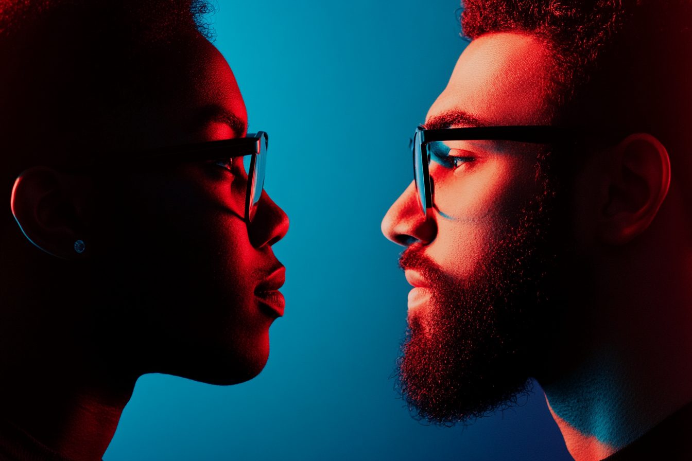
The divide between Light and Dark usage has puzzled me since learning about it, and just recently, I attended a tech conference. There, I witnessed two developers in their fifties—both with children and mortgages—argue over window preferences and quite literally, berate each other. “Light mode is objectively better for readability”, one of them declared. “Dark mode is objectively better for reducing eye strain”, the other countered with equal fervor. Clearly, both of them were using the term “objectively” inappropriately to justify Personal preferences that are the deeply subjective to say the least, emoji drum rolling all caps arguments over the windows light mode vs dark mode debate.
This form of barbarism exceeds misunderstands. Beneath dark mode, users mock light mode supporters as ineffectual keyboard warriors who succumb to the fear of the dark or unsophisticated tech neophytes. Defenders of light mode fire back with adding that dark mode users are basement-dwelling reclusive vampires or self-important elitist hackers who imagine themselves in the Matrix. Each faction firmly believes that their viewpoint is not merely distinguished from the other choice, but an improvement over it.
The most interesting part of this digital divide is how it goes beyond the typical socio-technical divides. Consider, for example, age, gender, and level of technological understanding; none seem to deterministically predict if a user would want their screens dark or light. I’ve encountered dark-mode-obsessed 70 year old grandmothers and light mode stubborn 22 year old software engineers. Preferences oscillate up and down various generational and occupational stratifications in nonsensical ways.
My own shift to dark mode came as a gradual process. In the 2000s, when dark mode was considered a developer’s preference, I remember the first time I started using dark themed editors for my code. In those days, using a black background with colorful syntax highlighting was a tacit declaration of your seriousness as a developer since casual computer users would never do such a thing. That practice came with digital snobbery—a visual shibboleth that marked the boundaries of the technical elite and the normies.
When dark mode started rolling out on consumer-level software and applications, I took to it right away, both because I actually preferred it, and, I admit, out of misplaced tech elitism. “Oh, so you use light mode? How… basic.” It’s not the best mindset to have, but I understood that it was the same urge that previously made me smug about using Linux or knowing keyboard shortcuts.
In the long run, my choice became more pragmatic. During my night working sessions, it was evident that dark mode was more forgiving for my eyes. It seemed to help alleviate the headaches I experienced from the excessive time I spent in front of a screen. And yes, I liked how images seemed to pop and how my devices felt more like advanced instruments than glowing documents.
But at some point, this preference turned more into a self-identity. I found myself forming stereotypes about light mode users (they probably also rock Comic Sans, have AOL emails, and own several dozen cringe joke t-shirts) and developing a completely unwarranted camaraderie with fellow dark mode lovers (they understand). Somewhere along the lines, my display choice was integrated into my self-identity as a person who appreciates technology.
In this case of identity fusion, I am not alone. A friend of mine with a background in UX design makes the remark that light/dark preference is “the digital equivalent of whether you’re a cat person or a dog person.” This is a binary option accompanied by many related values and traits which are unrelated to the choice itself. Dark mode users are thought to be more tech savvy, introverts or night owls, while light mode users are traditionalists, morning people, extroverts or maximalists. These assumptions carry no factualistic basis but are widely accepted notions of the digital world.
Within office contexts, this tribalism tends to escalate. One of the developers on my team confessed to me that he judges potential hires based on their light or dark mode preference during tech interviews. “If they’re using light mode, I wonder what other bad decisions they’re making,” he claims, saying this only half-jokingly. A product manager i know also openly admits to feeling “slightly suspicious” of dark mode fans, regarding their tendency as some counterculture preference that could disrupt corporate culture.
This divide is particularly humorous in how each side wields “science” to favor their side. Dark mode proponents cite studies of eye strain and battery savings. Light mode defenders tout research that claim better readability and reduced astigmatism symptoms. Both sides overly utilize and highlight the ‘scientific’ data that supports their stance while ignoring data that counters it.
As usual, the truth is more complicated than either camp is willing to acknowledge. The reality around us is that optimal display setting is determined by several factors such as external light, vision attributes of the individual, particular content, even the time of the day! There are no absolute answers, but people continue to consider their favored option as supreme.
I personally witnessed user preferences when our company removed dark mode for some users during a major unlock. The reaction was explosive. Users threatened to stop using the service altogether. One-star reviews inundated app stores. A Change.org petition was started within days and gathered thousands of signatures. Daily emails were sent consisting entirely of white text on black document demanding return of dark mode. One noted user was particularly unhappy and stated, “Why take away features and obligate me to stare at a screen filled with light?”
When we brought back Dark Mode a week later, the celebration from our users was, once again, disproportionate. Users almost praised us as if we had cured a disease instead of restoring a setting. One person even sent us a gift basket while the other created fan art of our logo on a black canvas that read, “Back in Black.”
All of this just because a feature that reverses a few colors.
There’s an underlying explanation. For a subset of the population, our screens serve as the primary interface we interact with during our waking hours. Working on tasks, consuming media, socializing, shopping, and even researching requires screen time attention. It’s only logical that, similar to how we wish to customize the wall colors of our house, or arrange furniture in our offices, we wish to have an idealized version of how our virtual environments look as well.
This brings us to the element of order. In a digital ecosystem saturated with omnipresent algorithms, the option to customize one’s display setting, no matter how trivial they may be, creates an illusion of control. “This is my digital space, and I will configure it however I choose,” is an empowering statement we could all use in this day and age overwhelmed with virtual precursors that dictate our interactions.
In what could be perceived as the most important point, our choices in technology is indicating digital tribalism. In an age where technology is everywhere but knowledge about it is limited, the ability to choose between two options, such as light vs. dark mode, provides an identity for one’s digital persona. Such preferences are a simplified representation of one’s intricate relationships with technology.
As for myself and my partner, we have come to an agreement where she engages in night mode after 9 PM to avoid blue light. While I try to refrain from vampire jokes when she powers her screens to full brightness. We set aside neutral zones for shared devices like the living room tablet.
The arrangement is tolerable. But in the case of a ‘digital civil war,’ it is ideal in the sense that no one has to convert or conquer. Users of different modes can inhabit the same digital areas without animosity, confidently displaying their preferences without needing to justify or demonstrate their default choice is better.
Only if they are not engaging in conversation with me, as dark mode is preferential. But I’ve advised against spreading that information. Some divides leave technological gaps that are best left unbridged.
")


